CopilotTextarea
An AI-powered textarea component for your application, which serves as a drop-in replacement for any textarea.
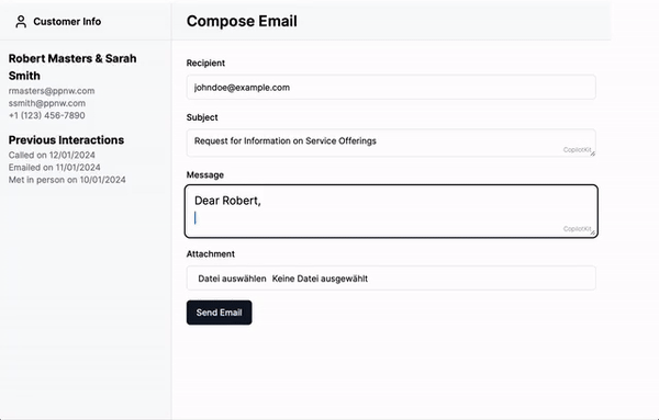
<CopilotTextarea> is a React component that acts as a drop-in replacement for the standard <textarea>,
offering enhanced autocomplete features powered by AI. It is context-aware, integrating seamlessly with the
useCopilotReadable hook to provide intelligent suggestions based on the application context.
In addition, it provides a hovering editor window (available by default via Cmd + K on Mac and Ctrl + K on Windows) that allows the user to
suggest changes to the text, for example providing a summary or rephrasing the text.
Example
import { CopilotTextarea } from '@copilotkit/react-textarea';
import "@copilotkit/react-textarea/styles.css";

<CopilotTextarea
  autosuggestionsConfig={{
    textareaPurpose:
     "the body of an email message",
    chatApiConfigs: {},
  }}
/>
Usage
Install Dependencies
This component is part of the @copilotkit/react-textarea package.
npm install @copilotkit/react-core @copilotkit/react-textareaUsage
Use the CopilotTextarea component in your React application similarly to a standard <textarea />,
with additional configurations for AI-powered features.
For example:
import { useState } from "react";
import { CopilotTextarea } from "@copilotkit/react-textarea";
import "@copilotkit/react-textarea/styles.css";

export function ExampleComponent() {
  const [text, setText] = useState("");

  return (
    <CopilotTextarea
      className="custom-textarea-class"
      value={text}
      onValueChange={(value: string) => setText(value)}
      placeholder="Enter your text here..."
      autosuggestionsConfig={{
        textareaPurpose: "Provide context or purpose of the textarea.",
        chatApiConfigs: {
          suggestionsApiConfig: {
            maxTokens: 20,
            stop: [".", "?", "!"],
          },
        },
      }}
    />
  );
}
Look & Feel
By default, CopilotKit components do not have any styles. You can import CopilotKit's stylesheet at the root of your project:
...
import "@copilotkit/react-textarea/styles.css";

export function YourRootComponent() {
  return (
    <CopilotKit>
      ...
    </CopilotKit>
  );
}
For more information about how to customize the styles, check out the Customize Look & Feel guide.
Properties
Prop
Type
Prop
Type
Prop
Type
Prop
Type
Prop
Type
Prop
Type
Prop
Type
Prop
Type
Prop
Type