Prebuilt Components
Drop-in chat components for your Mastra agent.
CopilotKit ships three prebuilt chat components that connect directly to your agent. Each is a wrapper around CopilotChat with a different layout — pick the one that fits your app and you're done.
If you've completed the quickstart, you already have one of these set up.
Setup
Import the default styles in your root layout:
import "@copilotkit/react-core/v2/styles.css";CopilotChat
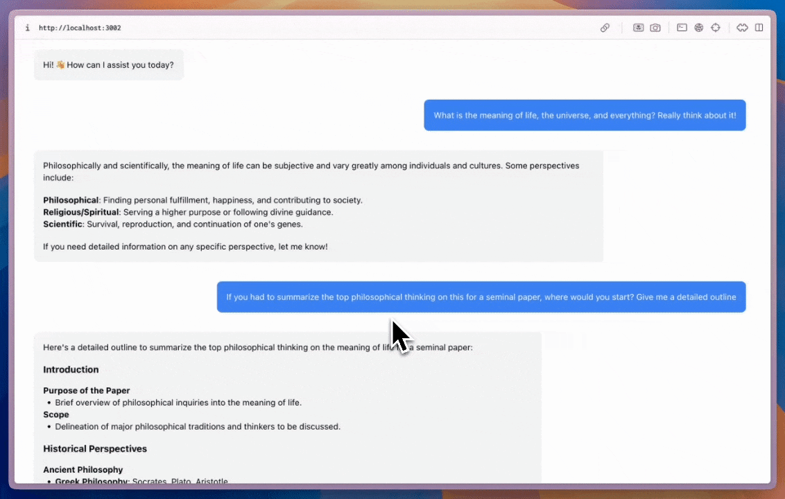
A flexible chat component that can be placed anywhere in your app and sized as needed.
import { CopilotChat } from "@copilotkit/react-core/v2";

export function YourComponent() {
  return (
    <CopilotChat
      labels={{
        welcomeMessageText: "Hi! How can I assist you today?",
      }}
    />
  );
}
CopilotSidebar
Wraps your main content and provides a collapsible sidebar chat.
import { CopilotSidebar } from "@copilotkit/react-core/v2";

export default function YourApp() {
  return (
    <main>
      <CopilotSidebar
        defaultOpen={true}
        labels={{
          modalHeaderTitle: "Sidebar Assistant",
          welcomeMessageText: "How can I help you today?",
        }}
      />
      <h1>Your App</h1>
    </main>
  );
}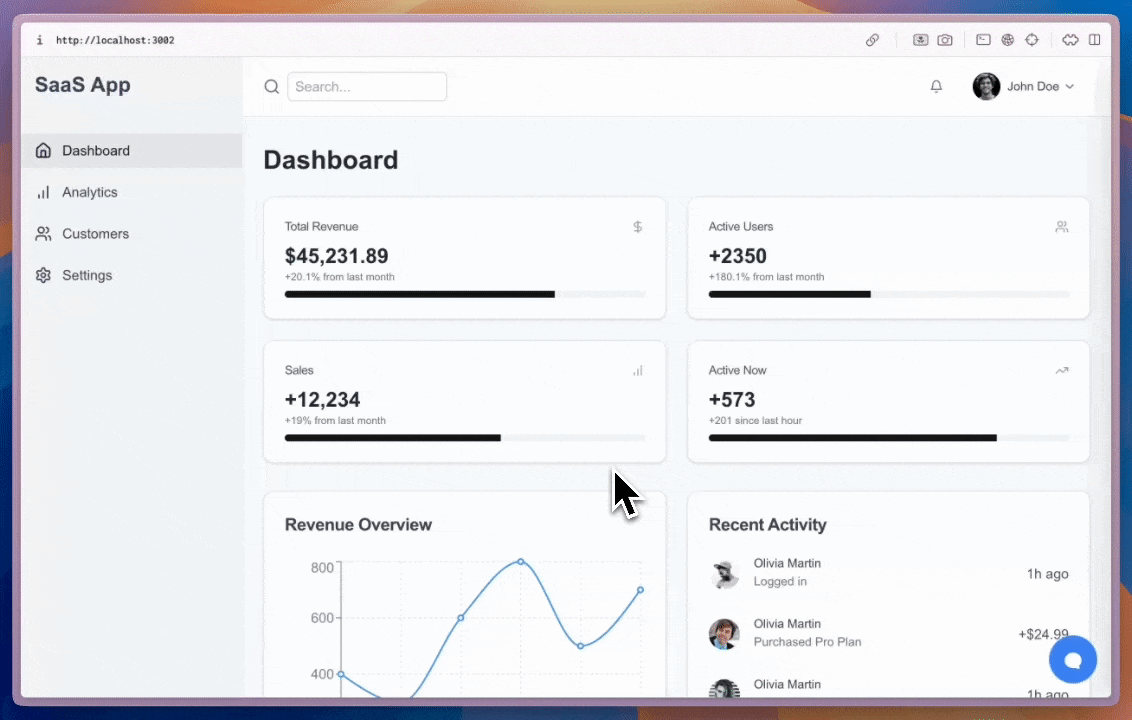
CopilotPopup
A floating chat bubble that sits alongside your content and toggles open/closed.
import { CopilotPopup } from "@copilotkit/react-core/v2";

export default function YourApp() {
  return (
    <main>
      <h1>Your App</h1>
      <CopilotPopup
        labels={{
          modalHeaderTitle: "Popup Assistant",
          welcomeMessageText: "Need any help?",
        }}
      />
    </main>
  );
}
Customization
All three components support the slot system for deep customization — from Tailwind classes to full component replacement:
<CopilotChat
  // Style slots with Tailwind classes
  input={{
    textArea: "text-blue-500",
    sendButton: "bg-blue-600 hover:bg-blue-700",
  }}
  // Customize nested message slots
  messageView={{
    assistantMessage: "bg-blue-50 rounded-xl p-2",
    userMessage: "bg-blue-100 rounded-xl",
  }}
/>