Prebuilt Components
Drop-in chat components for your Built-in Agent.
CopilotKit ships three prebuilt chat components that connect directly to your agent. Each is a wrapper around CopilotChat with a different layout — pick the one that fits your app and you're done.
If you've completed the quickstart, you already have one of these set up.
Setup#
Import the default styles in your root layout:
import "@copilotkit/react-core/v2/styles.css";CopilotChat#
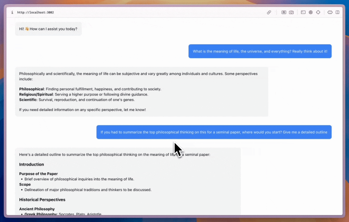
A flexible chat component that can be placed anywhere in your app and sized as needed.
import { CopilotChat } from "@copilotkit/react-core/v2";

export function YourComponent() {
  return (
    <CopilotChat
      labels={{
        welcomeMessageText: "Hi! How can I assist you today?",
      }}
    />
  );
}
CopilotSidebar#
Wraps your main content and provides a collapsible sidebar chat.
import { CopilotSidebar } from "@copilotkit/react-core/v2";

export default function YourApp() {
  return (
    <main>
      <CopilotSidebar
        defaultOpen={true}
        labels={{
          modalHeaderTitle: "Sidebar Assistant",
          welcomeMessageText: "How can I help you today?",
        }}
      />
      <h1>Your App</h1>
    </main>
  );
}
CopilotPopup#
A floating chat bubble that sits alongside your content and toggles open/closed.
import { CopilotPopup } from "@copilotkit/react-core/v2";

export default function YourApp() {
  return (
    <main>
      <h1>Your App</h1>
      <CopilotPopup
        labels={{
          modalHeaderTitle: "Popup Assistant",
          welcomeMessageText: "Need any help?",
        }}
      />
    </main>
  );
}
Customization#
All three components support the slot system for deep customization — from Tailwind classes to full component replacement:
<CopilotChat
  // Style slots with Tailwind classes
  input={{
    textArea: "text-blue-500",
    sendButton: "bg-blue-600 hover:bg-blue-700",
  }}
  // Customize nested message slots
  messageView={{
    assistantMessage: "bg-blue-50 rounded-xl p-2",
    userMessage: "bg-blue-100 rounded-xl",
  }}
/>