Declarative (A2UI)
Use A2UI to declaratively generate user interfaces.
Build an A2A agent, configure it to use A2UI, use the A2UI composer to generate widgets, and render them in your CopilotKit powered app.
Demo of the A2UI Composer - powered by CopilotKit
Getting started#
Clone the A2A starter template#
git clone https://github.com/copilotkit/with-a2a-a2ui.gitThe agent and application from the starter template are already configured to use A2UI, but details are included below for completeness.
Install dependencies#
pnpm installRun and connect your agent#
pnpm devConfigure your agent to use A2UI#
Setting up your agent with components#
The starter template is already configured to use A2UI, but lets look at how to add your own components.
RESTAURANT_UI_EXAMPLES = """
...
---BEGIN SINGLE_COLUMN_LIST_EXAMPLE---
[
  {{ "beginRendering": {{ "surfaceId": "default", "root": "root-column", "styles": {{ "primaryColor": "#FF0000", "font": "Roboto"
The widgets are injected into the agent's prompt, in this case using the RESTAURANT_UI_EXAMPLES variable.
Widgets are defined for the agent using examples of the json arrays they should output, wrapped in a comment block.
- A comment indicating the start of the example
- beginRendering: The start of the widget's rendering
- surfaceUpdate: An example of the json structure for the widget
- dataModelUpdate: an example of the data that will be used to populate the widget
- A comment indicating the end of the example
In the example repo, all of the widgets are defined in a single variable int the prompt_builder.py file, but you can structure them however you like, they simply need to be be injected into the agent's prompt in a clearly delineated way.
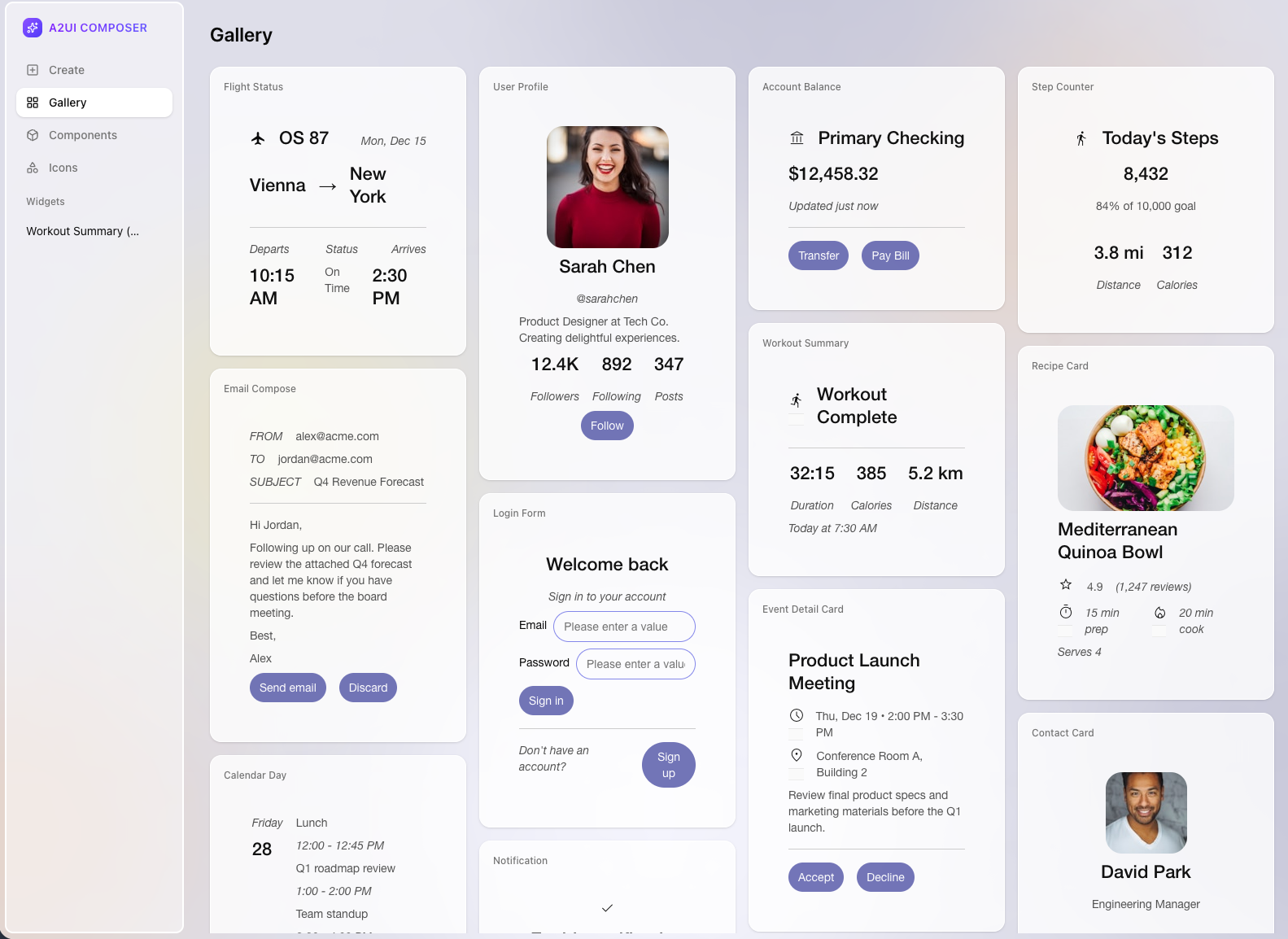
Generating components with the A2UI Composer#
If you want an easy way to generate components, you can use the A2UI Composer. Go to https://a2ui-composer.ag-ui.com/ to create your own components. The composer will generate the json spec for you, all you have to do is copy and paste it into your agent's prompt.
Configuring your application to render A2UI#
AG-UI handles communicating with your a2a agent, and passes the a2ui messages back and forth as ActivityMessage objects.
In order to render them in your frontend, you need to configure activity message rendering.
Copilotkit provides a renderer for A2UI messages, all you need to do is instantiate it with a theme and pass it to your CopilotKit.
"use client";


// Disable static optimization for this page
export const dynamic = "force-dynamic";

const A2UIMessageRenderer = createA2UIMessageRenderer({ theme });

export default function Home() {
  return (
    <CopilotKit
      runtimeUrl="/api/copilotkit"
      showDevConsole="auto"
      renderActivityMessages={[A2UIMessageRenderer]}
    >
      <main
        className="flex min-h-screen flex-1 flex-col overflow-hidden"
        style={{ minHeight: "100dvh" }}
      >
        <Chat />
      </main>
    </CopilotKit>
  );
}

function Chat() {
  return (
    <div className="flex flex-1 flex-col overflow-hidden">
      <CopilotChat style={{ flex: 1, minHeight: "100%" }} />
    </div>
  );
}
/** Elements */

const a = {
  "typography-f-sf": true,
  "typography-fs-n": true,
  "typography-w-500": true,
  "layout-as-n": true,
  "layout-dis-iflx": true,
  "layout-al-c": true,
};

const audio = {
  "layout-w-100": true,
};

const body = {
  "typography-f-s": true,
  "typography-fs-n": true,
  "typography-w-400": true,
  "layout-mt-0": true,
  "layout-mb-2": true,
  "typography-sz-bm": true,
  "color-c-n10": true,
};

const button = {
  "typography-f-sf": true,
  "typography-fs-n": true,
  "typography-w-500": true,
  "layout-pt-3": true,
  "layout-pb-3": true,
  "layout-pl-5": true,
  "layout-pr-5": true,
  "layout-mb-1": true,
  "border-br-16": true,
  "border-bw-0": true,
  "border-c-n70": true,
  "border-bs-s": true,
  "color-bgc-s30": true,
  "color-c-n100": true,
  "behavior-ho-80": true,
};

const heading = {
  "typography-f-sf": true,
  "typography-fs-n": true,
  "typography-w-500": true,
  "layout-mt-0": true,
  "layout-mb-2": true,
  "color-c-n10": true,
};

const h1 = {
  ...heading,
  "typography-sz-tl": true,
};

const h2 = {
  ...heading,
  "typography-sz-tm": true,
};

const h3 = {
  ...heading,
  "typography-sz-ts": true,
};

const iframe = {
  "behavior-sw-n": true,
};

const input = {
  "typography-f-sf": true,
  "typography-fs-n": true,
  "typography-w-400": true,
  "layout-pl-4": true,
  "layout-pr-4": true,
  "layout-pt-2": true,
  "layout-pb-2": true,
  "border-br-6": true,
  "border-bw-1": true,
  "color-bc-s70": true,
  "border-bs-s": true,
  "layout-as-n": true,
  "color-c-n10": true,
};

const p = {
  "typography-f-s": true,
  "typography-fs-n": true,
  "typography-w-400": true,
  "layout-m-0": true,
  "typography-sz-bm": true,
  "layout-as-n": true,
  "color-c-n10": true,
};

const orderedList = {
  "typography-f-s": true,
  "typography-fs-n": true,
  "typography-w-400": true,
  "layout-m-0": true,
  "typography-sz-bm": true,
  "layout-as-n": true,
};

const unorderedList = {
  "typography-f-s": true,
  "typography-fs-n": true,
  "typography-w-400": true,
  "layout-m-0": true,
  "typography-sz-bm": true,
  "layout-as-n": true,
};

const listItem = {
  "typography-f-s": true,
  "typography-fs-n": true,
  "typography-w-400": true,
  "layout-m-0": true,
  "typography-sz-bm": true,
  "layout-as-n": true,
};

const pre = {
  "typography-f-c": true,
  "typography-fs-n": true,
  "typography-w-400": true,
  "typography-sz-bm": true,
  "typography-ws-p": true,
  "layout-as-n": true,
};

const textarea = {
  ...input,
  "layout-r-none": true,
  "layout-fs-c": true,
};

const video = {
  "layout-el-cv": true,
};

const aLight = v0_8.Styles.merge(a, { "color-c-n5": true });
const inputLight = v0_8.Styles.merge(input, { "color-c-n5": true });
const textareaLight = v0_8.Styles.merge(textarea, { "color-c-n5": true });
const buttonLight = v0_8.Styles.merge(button, { "color-c-n100": true });
const h1Light = v0_8.Styles.merge(h1, { "color-c-n5": true });
const h2Light = v0_8.Styles.merge(h2, { "color-c-n5": true });
const h3Light = v0_8.Styles.merge(h3, { "color-c-n5": true });
const bodyLight = v0_8.Styles.merge(body, { "color-c-n5": true });
const pLight = v0_8.Styles.merge(p, { "color-c-n35": true });
const preLight = v0_8.Styles.merge(pre, { "color-c-n35": true });
const orderedListLight = v0_8.Styles.merge(orderedList, {
  "color-c-n35": true,
});
const unorderedListLight = v0_8.Styles.merge(unorderedList, {
  "color-c-n35": true,
});
const listItemLight = v0_8.Styles.merge(listItem, {
  "color-c-n35": true,
});

export const theme: v0_8.Types.Theme = {
  additionalStyles: {
    Button: {
      "--n-35": "var(--n-100)",
    },
  },
  components: {
    AudioPlayer: {},
    Button: {
      "layout-pt-2": true,
      "layout-pb-2": true,
      "layout-pl-3": true,
      "layout-pr-3": true,
      "border-br-12": true,
      "border-bw-0": true,
      "border-bs-s": true,
      "color-bgc-p30": true,
      "color-c-n100": true,
      "behavior-ho-70": true,
    },
    Card: { "border-br-9": true, "color-bgc-p100": true, "layout-p-4": true },
    CheckBox: {
      element: {
        "layout-m-0": true,
        "layout-mr-2": true,
        "layout-p-2": true,
        "border-br-12": true,
        "border-bw-1": true,
        "border-bs-s": true,
        "color-bgc-p100": true,
        "color-bc-p60": true,
        "color-c-n30": true,
        "color-c-p30": true,
      },
      label: {
        "color-c-p30": true,
        "typography-f-sf": true,
        "typography-v-r": true,
        "typography-w-400": true,
        "layout-flx-1": true,
        "typography-sz-ll": true,
      },
      container: {
        "layout-dsp-iflex": true,
        "layout-al-c": true,
      },
    },
    Column: {
      "layout-g-2": true,
    },
    DateTimeInput: {
      container: {
        "typography-sz-bm": true,
        "layout-w-100": true,
        "layout-g-2": true,
        "layout-dsp-flexhor": true,
        "layout-al-c": true,
      },
      label: {
        "layout-flx-0": true,
      },
      element: {
        "layout-pt-2": true,
        "layout-pb-2": true,
        "layout-pl-3": true,
        "layout-pr-3": true,
        "border-br-12": true,
        "border-bw-1": true,
        "border-bs-s": true,
        "color-bgc-p100": true,
        "color-bc-p60": true,
        "color-c-n30": true,
        "color-c-p30": true,
      },
    },
    Divider: {},
    Image: {
      all: {
        "border-br-5": true,
        "layout-el-cv": true,
        "layout-w-100": true,
        "layout-h-100": true,
      },
      avatar: {},
      header: {},
      icon: {},
      largeFeature: {},
      mediumFeature: {},
      smallFeature: {},
    },
    Icon: {},
    List: {
      "layout-g-4": true,
      "layout-p-2": true,
    },
    Modal: {
      backdrop: { "color-bbgc-p60_20": true },
      element: {
        "border-br-2": true,
        "color-bgc-p100": true,
        "layout-p-4": true,
        "border-bw-1": true,
        "border-bs-s": true,
        "color-bc-p80": true,
      },
    },
    MultipleChoice: {
      container: {},
      label: {},
      element: {},
    },
    Row: {
      "layout-g-4": true,
    },
    Slider: {
      container: {},
      label: {},
      element: {},
    },
    Tabs: {
      container: {},
      controls: { all: {}, selected: {} },
      element: {},
    },
    Text: {
      all: {
        "layout-w-100": true,
        "layout-g-2": true,
        "color-c-p30": true,
      },
      h1: {
        "typography-f-sf": true,
        "typography-v-r": true,
        "typography-w-400": true,
        "layout-m-0": true,
        "layout-p-0": true,
        "typography-sz-tl": true,
      },
      h2: {
        "typography-f-sf": true,
        "typography-v-r": true,
        "typography-w-400": true,
        "layout-m-0": true,
        "layout-p-0": true,
        "typography-sz-tm": true,
      },
      h3: {
        "typography-f-sf": true,
        "typography-v-r": true,
        "typography-w-400": true,
        "layout-m-0": true,
        "layout-p-0": true,
        "typography-sz-ts": true,
      },
      h4: {
        "typography-f-sf": true,
        "typography-v-r": true,
        "typography-w-400": true,
        "layout-m-0": true,
        "layout-p-0": true,
        "typography-sz-bl": true,
      },
      h5: {
        "typography-f-sf": true,
        "typography-v-r": true,
        "typography-w-400": true,
        "layout-m-0": true,
        "layout-p-0": true,
        "typography-sz-bm": true,
      },
      body: {},
      caption: {},
    },
    TextField: {
      container: {
        "typography-sz-bm": true,
        "layout-w-100": true,
        "layout-g-2": true,
        "layout-dsp-flexhor": true,
        "layout-al-c": true,
      },
      label: {
        "layout-flx-0": true,
      },
      element: {
        "typography-sz-bm": true,
        "layout-pt-2": true,
        "layout-pb-2": true,
        "layout-pl-3": true,
        "layout-pr-3": true,
        "border-br-12": true,
        "border-bw-1": true,
        "border-bs-s": true,
        "color-bgc-p100": true,
        "color-bc-p60": true,
        "color-c-n30": true,
        "color-c-p30": true,
      },
    },
    Video: {
      "border-br-5": true,
      "layout-el-cv": true,
    },
  },
  elements: {
    a: aLight,
    audio,
    body: bodyLight,
    button: buttonLight,
    h1: h1Light,
    h2: h2Light,
    h3: h3Light,
    iframe,
    input: inputLight,
    p: pLight,
    pre: preLight,
    textarea: textareaLight,
    video,
  },
  markdown: {
    p: [...Object.keys(pLight)],
    h1: [...Object.keys(h1Light)],
    h2: [...Object.keys(h2Light)],
    h3: [...Object.keys(h3Light)],
    h4: [],
    h5: [],
    h6: [],
    ul: [...Object.keys(unorderedListLight)],
    ol: [...Object.keys(orderedListLight)],
    li: [...Object.keys(listItemLight)],
    a: [...Object.keys(aLight)],
    strong: [],
    em: [],
  },
};
Give it a try!#
That's it! When your agent generates an A2UI message, it will be rendered in your frontend. A2UI actions (like button clicks) are automatically sent back to your agent via AG-UI.